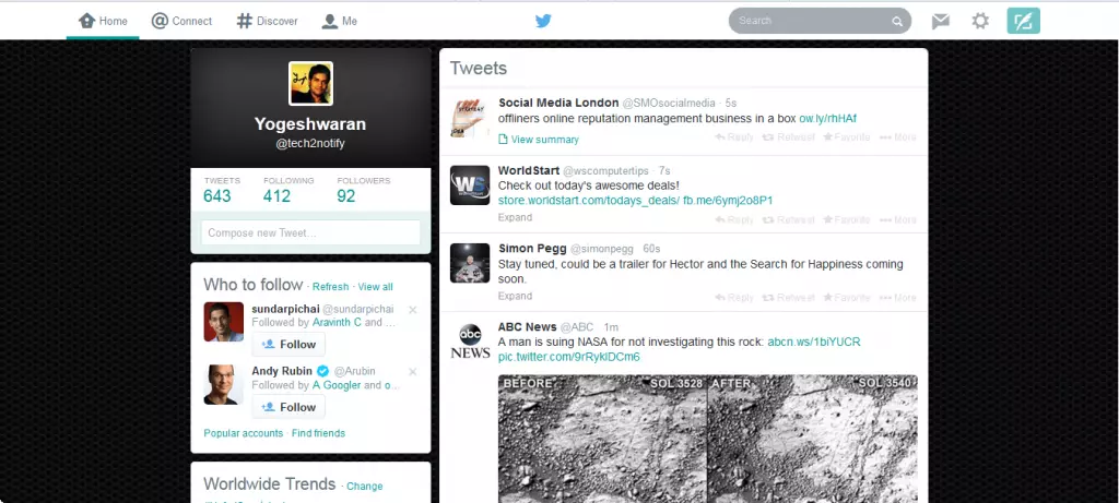
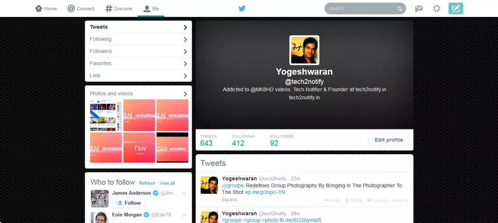
Twitter leaks about the new user interface for PC users on the 13th January 2014, and today is the day where Twitter updates its mobile app alike user interface to most of the users. I got the update! How about you all? Have you got the new user interface of Twitter?
Actually its look-alike Twitter covered with whitewash, as the new user interface looks “whitened” allot than the mobile app interface. But it looks better than the previous one, it’s a lot easier to navigate through with the new interface. No new options enabled in the new interface, other than few alignment and location changes. Direct message option gets its new location next to the search bar. The new Twitter bird icon at the center grabs my attention all the time.
If you still didn’t get the new interface on Twitter, just wait for a few seconds, hours and days. If you got some more points to add to this notification, share it with us in the comment section.
In short to justify the new interface we can say, “its neat and elegant to use.”


