As we all know, YouTube is a video-sharing website, and it is one among the top ten websites with a large amount of visitors reaching it daily. Have you notified the changes made in YouTube? There’s a slight change in video player control, and it is publically available to all users who can make use of the new controls.
Read More About Android Device Manager.
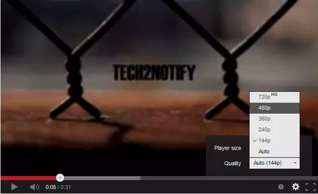
YouTube creator’s posted in Google+, “Notice something a little different about YouTube videos? We’ve just launched a new version of the player with improved caption controls and a cleaner look. If you’re looking for the annotations switch, just click the gear button – you’ll find size and quality controls there too.”
In the new feature YouTube had merged the video quality, annotations and player size controls together, where in the old player it will have separate function icons. In the old version when you click the gear button in the video player you will be getting only the video quality functions, and there will be separate function icon for video size available aside of the gear icon. But in new UI video quality, player size and annotations functions are merged in gear icon itself.
It was a cool update by reducing the function icons in the player and its comfortability will be varied with each users, some may find it better option and some may find the old one was better.
And what’s your opinion about the new user interface of YouTube, just comment about it below.
HAPPY YOUTUBING!!!


