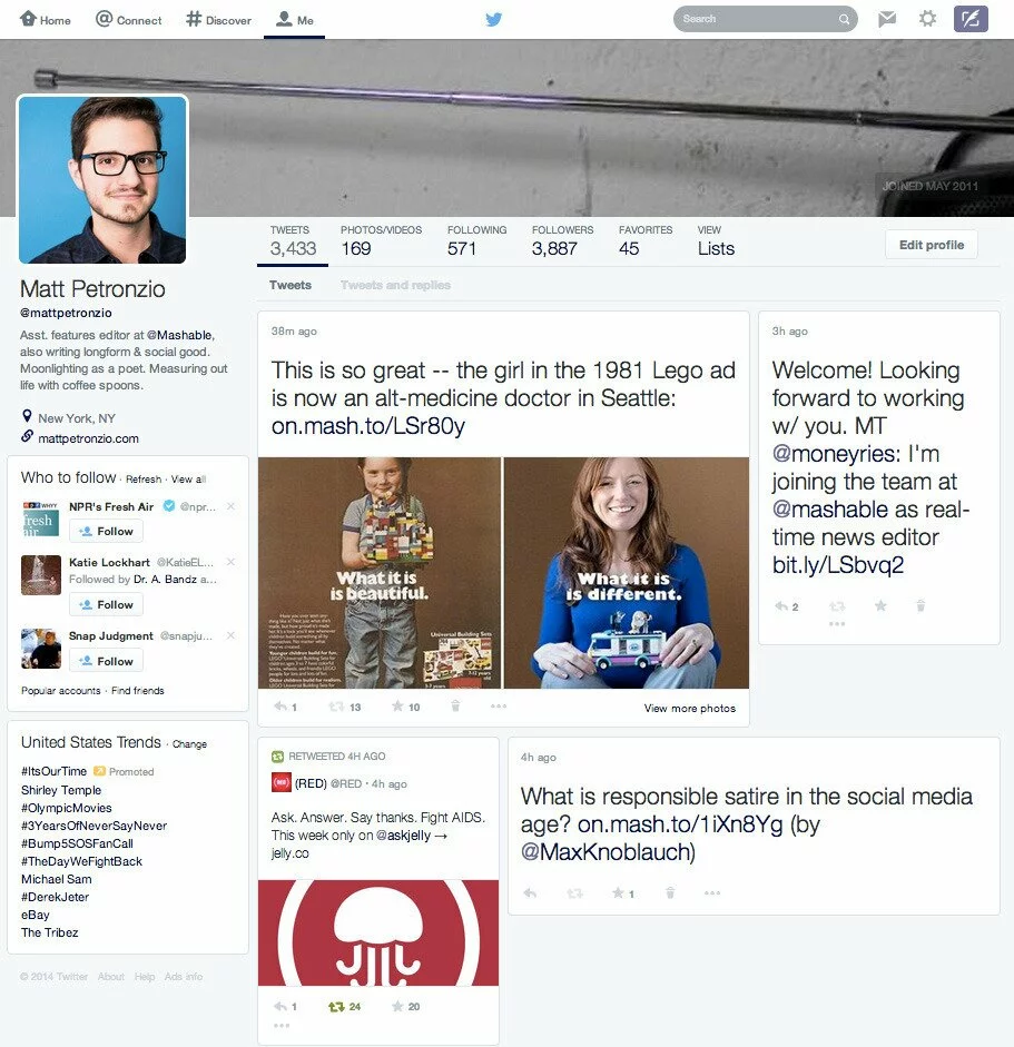
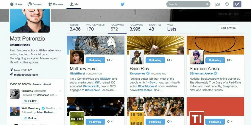
As of late, we all got Twitter’s new user interface a week back, which was solidly applauded by few and others didn’t. And now Twitter once again started testing another user interface with selected users account. Last time it was a whitewash update from Twitter and this time its rival time with its marginally equal social network (rival time in the sense of new user interface). Yep, Twitter is taciturnly testing out a new user interface which got some ingredients of the Facebook timeline interface.
Thanks to Matt Petronzio(@mattpetronzio) Assistant Features Editor at Mashable for unveiling the new Twitter interface to us. You can have a look at the new interface, and say about it in the comment section below.
In reality, if twitter rolls out this update to all its users, then it will lose its unique signature look which makes them great. And Twitter can proudly mention in footer that, “Design is truly inspired from Facebook timeline interface.”
If you would like to add something to this notification, please share it with us in the comment section.
SOURCE: Mashable

