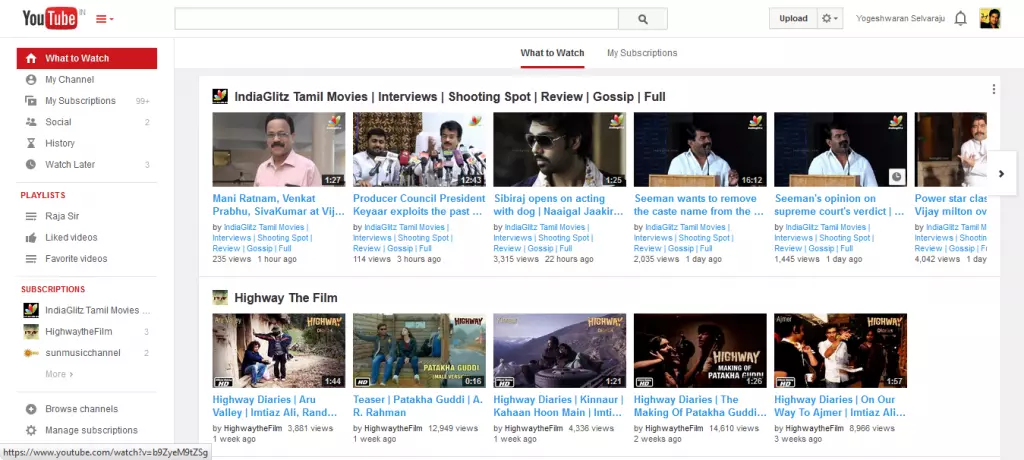
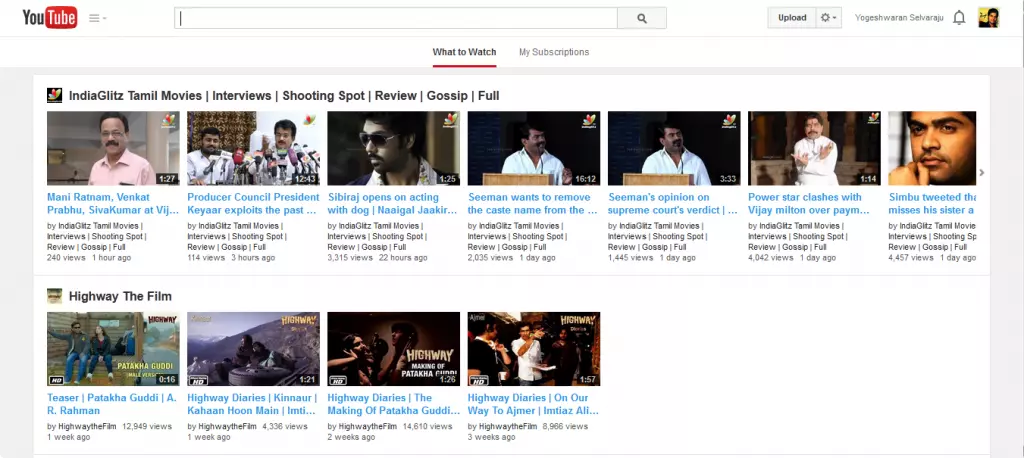
On January 11, 2014 we notified you about the YouTube’s new User Interface, which was in testing mode by allowing selected user to review it and send feedback to YouTube to make it better. After all the testing, feedbacks and reviewing the newly redesigned YouTube Interface available to all YouTuber’s today. To be noted that Google rolls a redesigned web version of Google Maps to all users few days back.
Sure, there are some changes made in the new version compared to the testing version, as the feedback received from the users taken into account and they have improvised it to a better one.
The Guide button went next to the YouTube logo, since in testing version it was below the logo. Users made a complaint that it would take some extra clicks to reach their subscription list, as users need to click on the Guide button and hover down to Subscriptions, once again hovering to the Subscribed list to select. But now The Guide list can be kept open or closed according to the users need.
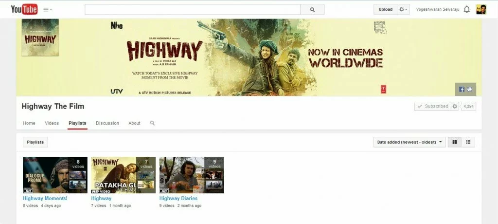
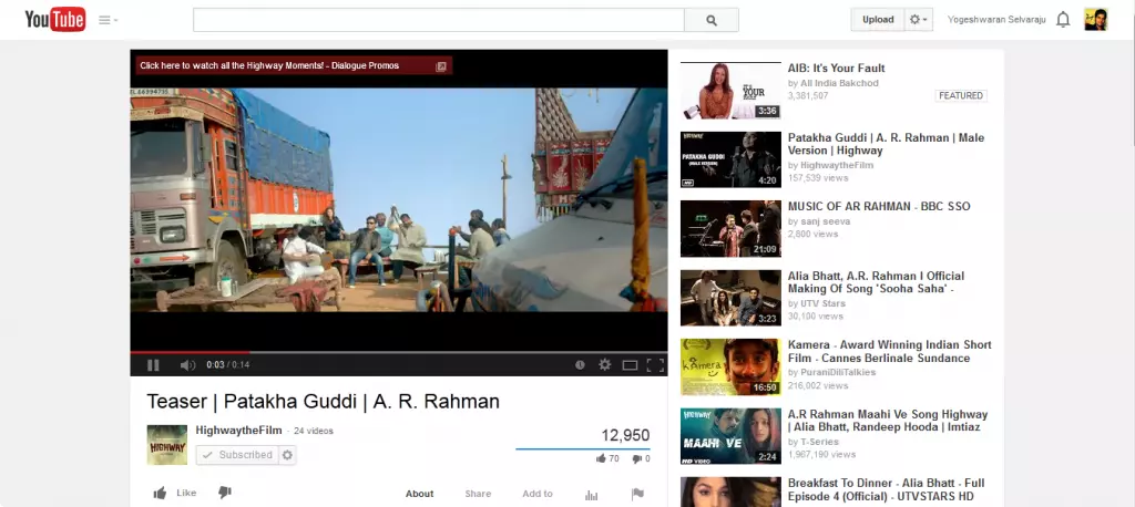
The upload button too went up, next to the search box, which can be done to make the search box center aligned. And they had added Playlist option to the streamlined process, which make us easy to find the playlist available in all subscription lists.
YouTube started rolling out this new interface to all its users from today, if you still didn’t get the update, please wait for a few hours or days to reach you. Till then enjoy YouTubing.
If you would like to add something to this notification, please share it with us in the comment section.

