This weeks hot topic is all about the acquisition of WhatsApp by Facebook for $19 billion. And we got a vast topic to discuss with our colleagues during our working hours. But it seems like only we were time-passing by discussing about the acquisition, and Facebook employees weren’t bothered about it as they were busy in testing a new layout for their social network.
Regarding the new layout, YouTube rolls out a newly redesigned User Interface to all YouTubers today. And Facebook spotted testing a new layout with selected users. This time I was a little unlucky to get the new layout of Facebook before the launch, my friend Harsh Agarwal is lucky enough to preview the new layout.
Here’s the screenshot of the new layout tested by Facebook,
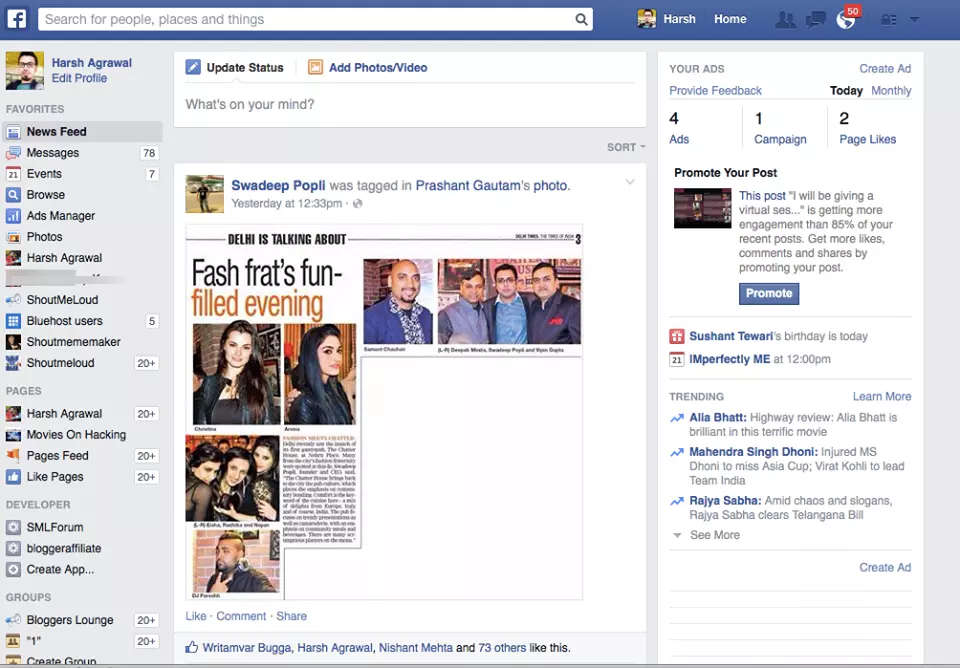
A few changes made in the header as our display picture appears right next to the search bar with our name and home link. Whereas in the older version the name and home link appears next to the notification icon.
It seems like background of the Facebook wall got painted in light gray color, and the feeds are in white color to differentiate it from the background options. In older version each section would be divided using a thin line between them. The icons were also upgraded to a newer version.
To be noted that few days back Twitter spotted to be testing a new layout similar to Facebook’s layout.
If you would like to add something to this notification, please share it with us in the comment section.


The new layout appeared yesterday in my timeline. I hated it. The items in the timeline got bigger which makes the browser slow to load more items when I go down the scroll. And the bigger items I thought made it very indiscreet, ex. when you access your facebook in the office work and others see what you’re seeing, for example. I didn’t like to change the notifications to the right side, left me confused. But what I found worse in the layout is the image of the top of friendlist’s area. Has a pseudo-intelligence that generates the top imagem of the friendslist from photos that you have marked with these friends. And there is no option to change or remove this! So if you have an inappropriate picture with your friends
and open this page at work, for example, you know have the risk of this image appears in the top of your page list. Solution for this? Remove tags or photos. Terrible. I want my old, clean and functional layout back.