As a sequel of Google’s search page redesign, we got Gmail log-in page redesigned with a mere compact look and its undoubtedly gives the look of mobile app log-in page which got updated few months back. There were no sources pointed out from Google towards the new update made in Gmail log in page. Some of you may have already notified the changes made, if not here it is.
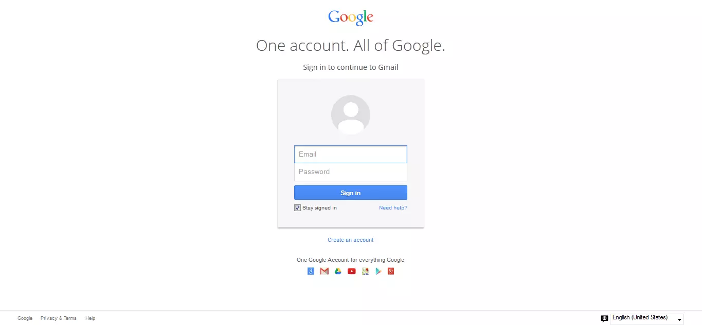
Here’s the updated look of Gmail log-in page,
And here’s the out dated look of Gmail log-in page,
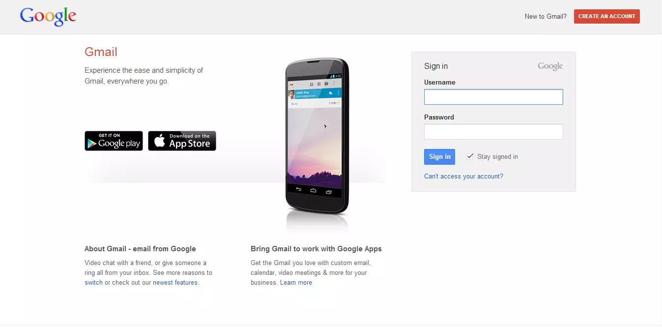 Thus the logo and log-in box got centered in updated look. It got no text at the bottom of log-in page like “About Gmail…” – “Bring Gmail…” and some other blah blah which was there at outdated look. As mentioned earlier it looks so mere compact to me, and you can also mention your opinion about the update in comment box below.
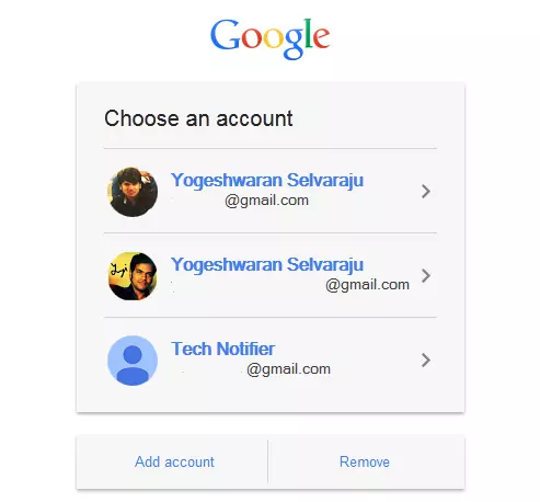
Additional feature enabled in redesign is it will save all the log-in history we made, and lets you to enter only the password by saving Email ID. If you sign out you will be seeing a new page with all your mail accounts you logged in. So you can choose the account and enter only the password and there’s no need of typing in the Email ID.
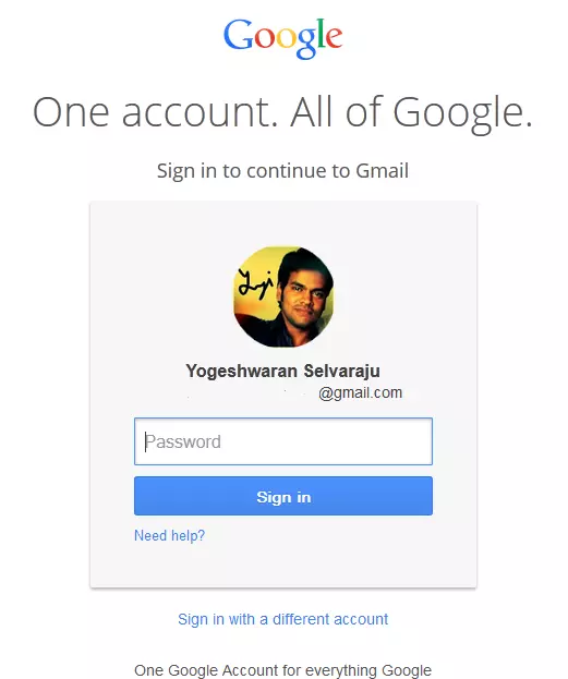
After choosing the account just enter the password to log-in,
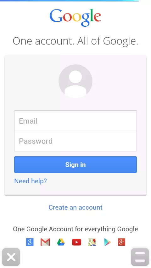
And the screenshot given below is the mobile log-in page which got updated on August month,
If you still didn’t get the redesign just wait for few days and let the Google roll out the update to all Googlers. And what’s your opinion about the update?
About The Brand:
Official site : http://www.google.com
Google Inc. is an American multinational corporation Read more here


