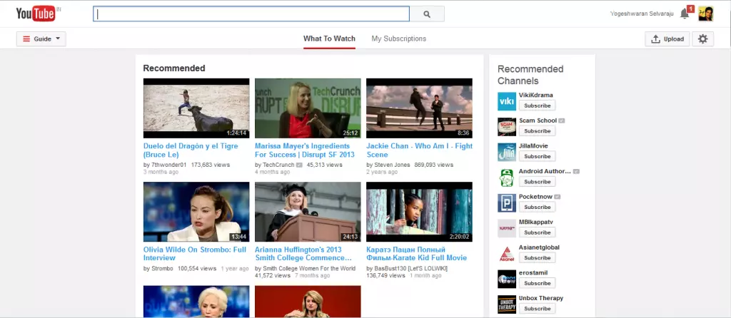
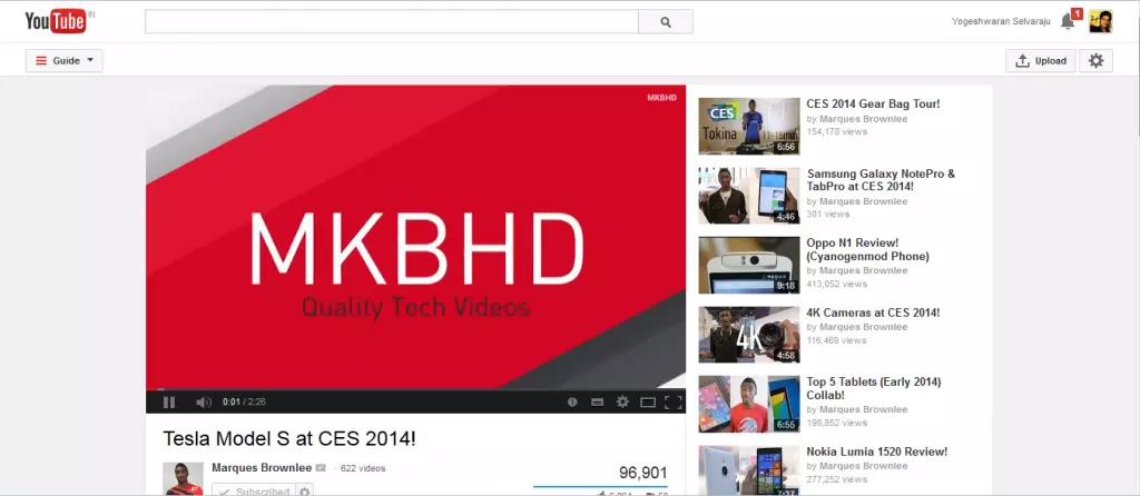
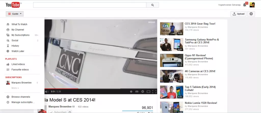
Its a surprise update from YouTube. I was just stumbling upon few videos in YouTube today and suddenly notified few changes made in YouTube, which projected YouTube in a new way. Actually its not just few changes as you can notify the changes made in it by seeing the screenshot below.
UPDATE: YouTube Started Rolling Out It’s Newly Redesigned User Interface To All Users.
The new UI looks so neat and simple as it highlights each portion in a separate layout. The combination of colors used to highlight looks old, but it looks astonishing while using.
YouTube adds two section called What to Watch and My Subscription to the Center, Guide to the left and Settings and Upload button at the right.
There were no update available officially regarding the new UI, so YouTube might be testing new UI with few users only. I’m glad that I was in the list of few users. ![]()
However have you got the new UI of YouTube? check out by visiting YouTube now.
Here’s a YouTube video about the update,
Yogeshwaran Selvaraju
Latest posts by Yogeshwaran Selvaraju (see all)
- 10 Best Android Apps To Create Your Own Memes & Bitstrips - Jul 3, 2014
- Google Launches “Apps for Android Wear” Section On Play Store - Jul 3, 2014
- Apple’s New iPhone 5s TV Ad Features About ‘Parenthood’ - Jul 1, 2014


It’s fucking awful, you now need 3 clicks instead of 1 to go to one of your subscribed channels.
Dihi666 Sure, it is. It resembles Google+.
Thanks for the early report; the UI looks great. Can you share the opt-in cookie with us (if you can find it?)
Replying to myself here: Actually scrap that, found the cookie. If anyone wants to try this new UI now, go to YouTube, open the inspector, go to Console, type this in and press enter:
document.cookie=”VISITOR_INFO1_LIVE=_wVil4PwtpA; path=/; domain=.youtube.com”;window.location.reload();
Mike Hussion Does this code works for?
Yogeshwaran Selvaraju Mike Hussion It’ll let you force the new Google UI on a browser that doesn’t normally have it. It tells Google to add the cookie manually to the browser, which in most cases will greenlight the whole account for the new UI. Worked nicely for me.
Dihi666 You need one mouseover and one click, by default, at the MOST. If you close the Guide (which, why would you?) you still only need two clicks, counting the click to access the channel itself, and one click is AJAX-based. And not only that, it’s now only one click (down from 3, actually) to access your playlists. I can understand how people would not like the UI change, I suppose, but it really cannot be argued that the new UI improves overall usability.